Logos & Brands
The Magie des Enfants logo, wordmark, and symbol are important expressions of our brand identity. They have each been carefully designed and constructed to achieve visual harmony, should never be altered, modified, or redrawn. Because these elements are such recognizable and highly visible brand assets, it is vital that that they are always applied consistently.

These few simple rules will help you use our logo and wordmark to communicate the Magie des Enfants brand most effectively.
The Logo
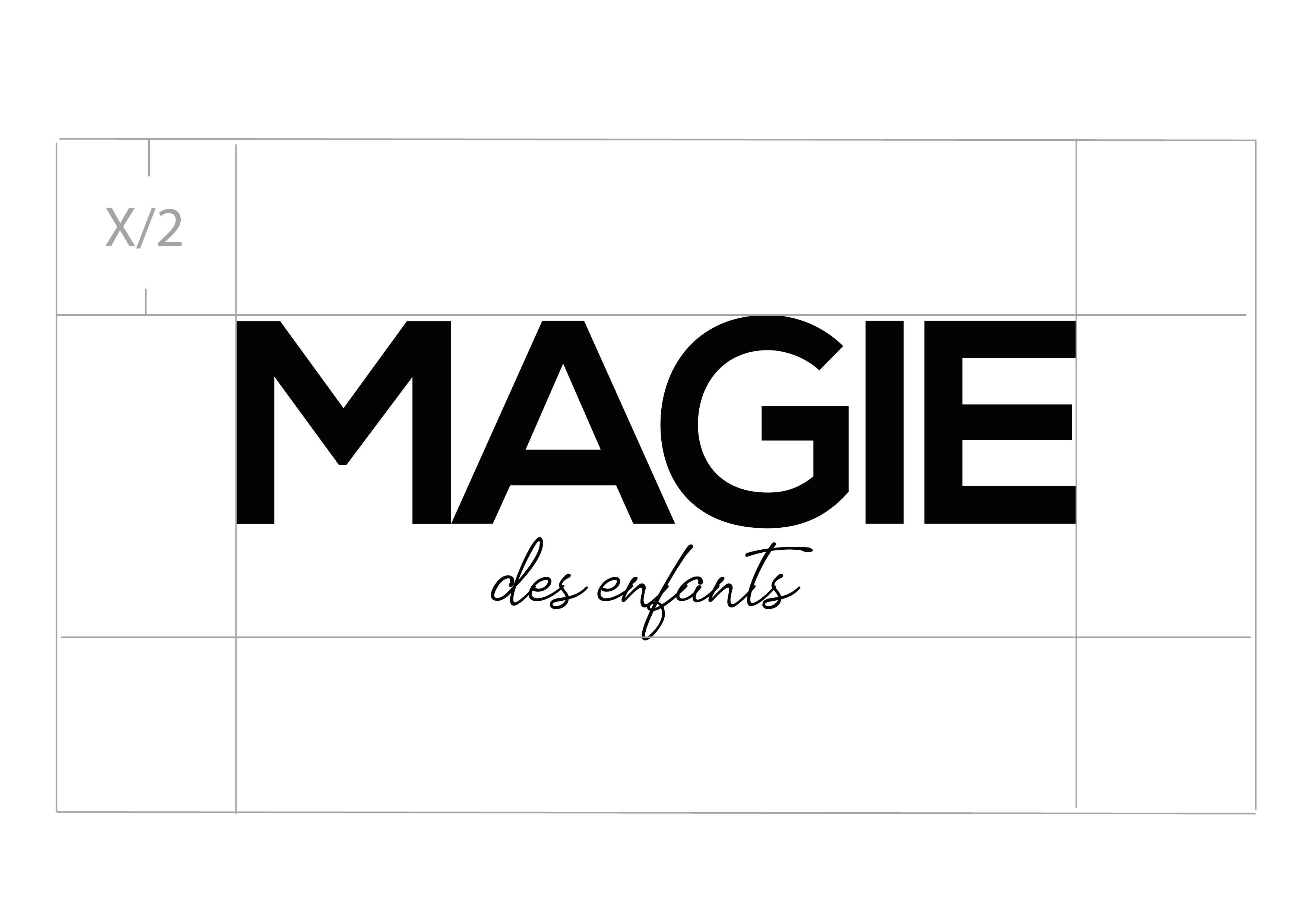
This is the Magie des Enfants logo. It is our primary graphic device and should be the first choice when choosing a graphic element to represent the Magie des Enfants brand.

The Magie des Enfants logo. Minimum digital size: 50 pixels (height)
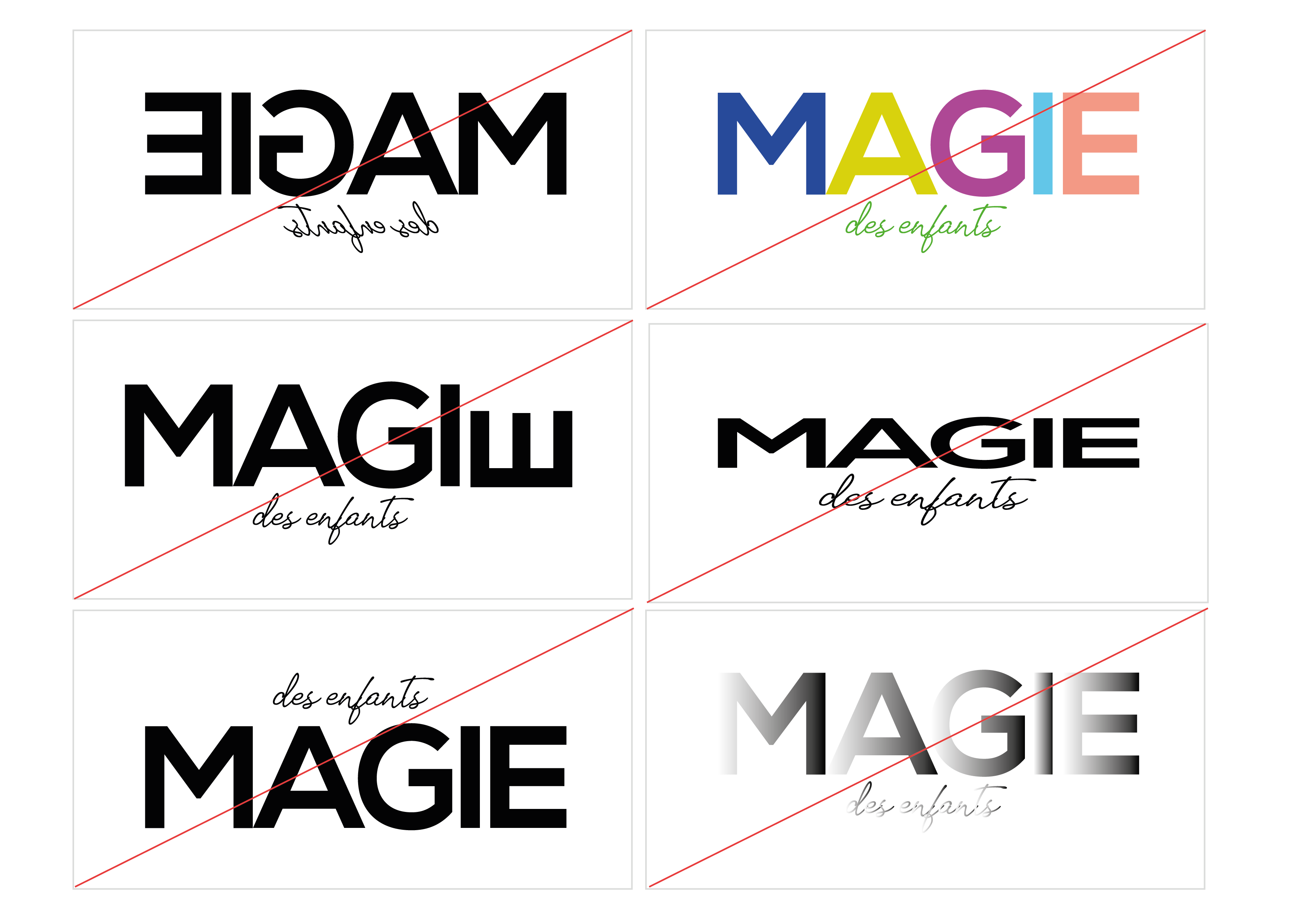
Incorrect usage of the logo:
- Do not reverse the logo.
- Do not apply colors.
- Do not rotate any single part of the logo.
- Do not stretch or alter the proportions of the logo.
- Do not change the arrangement of the logo.
- Do not apply gradients, shadows, or other effects.
Logo + Color
Our logo should always be all black or all white. It never takes on any additional colors, but may be placed on top of any color within the Medium brand palette with the exception of placing a white logo on top of yellow or any of the light colors within the palette.
Black and white:
The logo may be used as all black on white or all white on black.

Logo clearspace and margins
When using the logo in a design or placing it next to other visual elements, you should ensure that it has plenty of room to breathe. This is where clearspace and margins come in to play.
The logo’s clearspace defines the distance between the logo and any graphic element it may be sitting next to in a composition. Use the cap height from the wordmark as a reference for the appropriate clearspace. Cap height = X
For example: if you were to place the Magie des Enfants logo, sized 50px tall, in a logo pool next to other logos, you should ensure that the Magie des Enfants logo has at least 30px of clearspace on all sides.
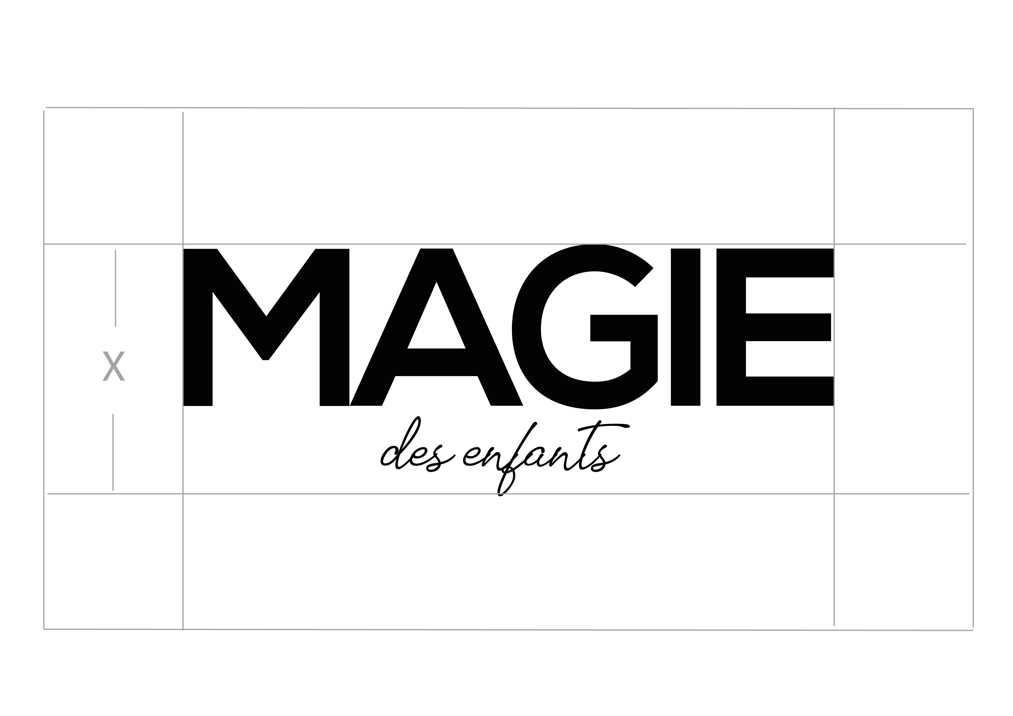
The logo’s margins are the space between the logo and the edge of the composition. When placing the logo in a composition use half the cap height (X/2) as the distance to the margin.
This is a suggested margin, do not place the logo any tighter — but in certain instances the space can be increased.
For example: if you were to place the logo, sized 50px tall, in the top left corner of a composition, the distance between the top and left sides of the logo and the top and left edges of the composition should be no less than 25px.
